
Developer Tools
Vercel — Agentic Infrastructure (reference)
FreeDeveloper platform. Monumental display type, spare monochrome palette, generous negative space.
Source · vercel.com
The DESIGN.md
Drop this file into your project and tell your agent to follow it: colors, type, spacing, and the reasoning behind them. A style match, never a pixel copy.
DESIGN.md
---
name: "Vercel — Agentic Infrastructure (reference)"
description: "Developer platform. Monumental display type, spare monochrome palette, generous negative space."
colors:
  primary: "#171717"
  canvas: "#fafafa"
  ink: "#000000"
  ink-muted: "#666666"
  surface-dark: "hsla(0, 0%, 9%, 1)"
  accent-cyan: "#50e3c2"
typography:
  display:
    fontFamily: "GeistSans, \"GeistSans Fallback\""
    fontSize: "4rem"
    fontWeight: "400"
    lineHeight: "1"
    letterSpacing: "-0.059em"
  h2:
    fontFamily: "GeistSans, \"GeistSans Fallback\""
    fontSize: "0.875rem"
    fontWeight: "500"
    lineHeight: "1.43"
  body-mono:
    fontFamily: "\"Geist Mono\", ui-monospace, SFMono-Regular, \"Roboto Mono\", Menlo, Monaco, \"Liberation Mono\", \"DejaVu Sans Mono\", \"Courie"
    fontSize: "0.875rem"
    fontWeight: "400"
    lineHeight: "1.43"
    textTransform: "uppercase"
  label:
    fontFamily: "GeistSans, \"GeistSans Fallback\""
    fontSize: "0.875rem"
    fontWeight: "400"
    lineHeight: "1.5"
  caps-mono:
    fontFamily: "\"Geist Mono\", ui-monospace, SFMono-Regular, \"Roboto Mono\", Menlo, Monaco, \"Liberation Mono\", \"DejaVu Sans Mono\", \"Courie"
    fontSize: "0.875rem"
    fontWeight: "600"
    lineHeight: "1.43"
    letterSpacing: "0.071em"
    textTransform: "uppercase"
rounded:
  xs: "2px"
  sm: "6px"
  full: "9999px"
spacing:
  xs: "4px"
  sm: "6px"
  md: "12px"
  lg: "16px"
  xl: "20px"
  2xl: "32px"
  3xl: "40px"
  4xl: "44px"
containerMaxWidth: "1448px"
---

> Reverse-engineered from a live Chrome session on [https://vercel.com](https://vercel.com) — computed styles, DOM inspection, and pixel sampling. Values are **measured, not estimated**, unless flagged.

## Overview

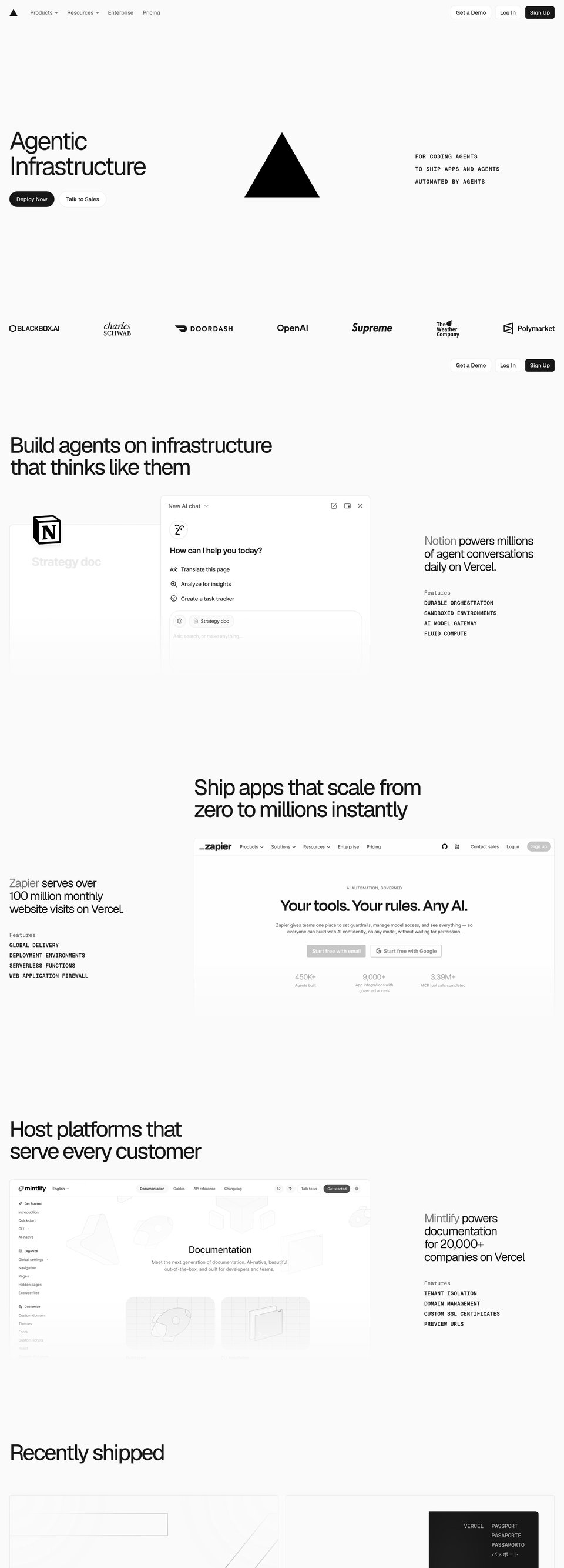
This visual language is intentionally minimal and typographic. The site favors an expansive, almost architectural white canvas (#fafafa) punctuated by very dark anchors (#171717 and #000000) and large, low-frequency graphic marks. The effect reads as high-clarity product documentation and launch-stage marketing at once: quiet surfaces, loud typography.

The system exists to make product and technical certainty legible. Big display type (h1 at 64px) establishes message rhythm and hierarchy while a consistent mono voice (the measured "Geist Mono" stack) supplies the utilitarian, engineer-facing tone used for microcopy and labels. Color usage is intentionally limited: the page background (#fafafa) plus two black weights (#171717 and #000000) handle nearly all hierarchy, with small accents defined in the design tokens (for example --geist-cyan: #50e3c2) reserved for micro interactions and status.

Signature artwork is a simple, bold black triangle rendered as an SVG with solid fills (heroArt reports an SVG with a solid fill color of #000000). The triangle repeats as a compositional anchor across pages — large, centered in hero bands or nested within cards — reinforcing a geometric, schematic brand motif. Photography or colored gradients are not a primary voice on the page (gradients are present in the CSS inventory, but hero artwork is dominated by the single black SVG).

**Key characteristics**
- Monochrome-first: dominant canvas #fafafa with black anchors (#171717 / #000000).
- Typographic gravity: oversized display (h1 fontSizePx: 64) paired with tight monospace labels.
- Spacious rhythm: very generous whitespace and large container max widths (examples include 1448px and 1400px).
- Two-radius system: consistent modest corners (6px) plus pill rounding for primary CTAs.
- Minimal elevation: almost no shadows; surfaces are defined by spacing and subtle borders rather than heavy drop shadows.
- Geometric motif: single bold SVG artwork (black triangle) repeated as a signature mark.

*A style reference distilled from [https://vercel.com](https://vercel.com) — never a pixel copy.*

## Colors

### Palette (by role)
| Token | Value | Usage |
|---|---|---|
| primary | #171717 | Primary foreground / call-to-action dark fills and bold UI anchors (e.g. filled CTA 'Deploy Now'). |
| canvas | #fafafa | Page background and large surface bands (site background is #fafafa; main band uses this value). |
| ink | #000000 | Graphic artwork and hard black accents — used for the hero triangle SVG and logomarks (heroArt solid fill colors include #000000). |
| ink-muted | #666666 | Secondary text and subdued UI labels across the site. |
| surface-dark | hsla(0, 0%, 9%, 1) | Deep surface used for alternative dark blocks and heavy chrome (matches --color-gray-1000). |
| accent-cyan | #50e3c2 | Sparingly applied accent from the design system variables (use for small status or brand accents, per --geist-cyan). |

### Surfaces (measured, area-weighted)
| Background | Weight |
|---|---|
| #fafafa | ×478 |
| #171717 | ×45 |
| #ffffff | ×20 |
| lab(7.78201 -0.0000149012 0) | ×11 |
| #0070f3 | ×0 |

### Ink (measured text colors)
| Color | Elements |
|---|---|
| #666666 | ×70 |
| #171717 | ×49 |
| #4d4d4d | ×14 |
| lab(80.976 0 -0.0000119209) | ×6 |
| #ffffff | ×3 |
| #7d7d7d | ×3 |
| #297a3a | ×3 |
| #0072f5 | ×1 |
| #8f8f8f | ×1 |
| #0070f3 | ×1 |

### Hairlines & borders
| Color | Elements |
|---|---|
| #171717 | ×9 |

### Gradients (computed, exact stops)
- `linear-gradient(to top in oklab, rgb(250, 250, 250) 0%, rgba(0, 0, 0, 0) 100%)`
- `radial-gradient(circle at left top, rgb(250, 250, 250) 0%, rgba(0, 0, 0, 0) 30%), radial-gradient(circle at right top, rgb(250, 250, 250) 0%, rgba(0, 0, 0, 0) 30%), radial-gradient(circle at right bottom, rgb(250, 250, 250) 0%, rgba(0, 0, 0, 0) 30%)`
- `linear-gradient(rgb(0, 255, 149) 0%, rgb(255, 208, 0) 25%, rgb(255, 23, 68) 50%, rgb(149, 0, 255) 75%, rgb(0, 229, 255) 100%)`
- `linear-gradient(90deg, rgb(255, 220, 48) 0%, rgb(56, 162, 255) 100%)`
- `linear-gradient(to right bottom, rgba(0, 0, 0, 0) 0%, lab(100 0 0) 100%)`
- `linear-gradient(to right in oklab, rgba(0, 0, 0, 0) 0%, rgb(255, 255, 255) 100%)`

### Signature artwork (svg)
solid fill colors declared in the hero SVG.
| Cluster | Frequency |
|---|---|
| #000000 | ×1 |

### The site's own tokens (CSS custom properties)
| Variable | Computed value |
|---|---|
| `--font-sans` | "GeistSans", "GeistSans Fallback" |
| `--font-mono` | "Geist Mono", ui-monospace, SFMono-Regular, Roboto Mono, Menlo, Monaco, Liberation Mono, DejaVu Sans Mono, Courier New, monospace, Apple Col |
| `--color-gray-200` | hsla(0, 0%, 92%, 1) |
| `--color-gray-300` | hsla(0, 0%, 90%, 1) |
| `--color-gray-500` | hsla(0, 0%, 79%, 1) |
| `--color-gray-600` | hsla(0, 0%, 66%, 1) |
| `--color-gray-700` | hsla(0, 0%, 56%, 1) |
| `--color-gray-800` | hsla(0, 0%, 49%, 1) |
| `--color-gray-900` | hsla(0, 0%, 30%, 1) |
| `--container-xs` | 20rem |
| `--container-sm` | 401px |
| `--container-md` | 601px |
| `--container-lg` | 961px |
| `--container-xl` | 1200px |
| `--container-2xl` | 1400px |
| `--container-3xl` | 48rem |
| `--container-4xl` | 56rem |
| `--container-5xl` | 64rem |
| `--text-base` | 1rem |
| `--text-lg` | 1.125rem |
| `--text-xl` | 1.25rem |
| `--text-2xl` | 1.5rem |
| `--text-3xl` | 1.875rem |
| `--text-4xl` | 2.25rem |
| `--text-5xl` | 3rem |
| `--text-7xl` | 4.5rem |
| `--text-8xl` | 6rem |
| `--tracking-normal` | 0em |
| `--radius-3xl` | 1.5rem |
| `--blur-xs` | 4px |
| `--blur-sm` | 8px |
| `--blur-lg` | 16px |
| `--blur-xl` | 24px |
| `--perspective-distant` | 1200px |
| `--default-font-family` | "GeistSans", "GeistSans Fallback" |
| `--default-mono-font-family` | "Geist Mono", ui-monospace, SFMono-Regular, Roboto Mono, Menlo, Monaco, Liberation Mono, DejaVu Sans Mono, Courier New, monospace, Apple Col |
| `--color-background-100` | hsla(0, 0%, 100%, 1) |
| `--color-gray-1000` | hsla(0, 0%, 9%, 1) |
| `--color-gray-alpha-400` | #00000014 |
| `--geist-cyan` | #50e3c2 |

*(+120 more captured)*

- Canvas: use #fafafa as the primary page background and band background (measurements: backgrounds include {"value":"#fafafa","count":478}).
 - Primary text / chrome: use #171717 for most headings and strong UI text (textColors includes {"value":"#171717","count":49}).
 - Graphic black: the hero artwork and logo marks use #000000 (heroArt lists a solid fill color: {"value":"#000000","count":1}).
 - Secondary text: use #666666 for muted copy and supporting labels (textColors includes {"value":"#666666","count":70}).
 - Accent: reserve #50e3c2 (CSS var --geist-cyan) and other tokenized color ramps in cssVars for small-status accents; do not introduce large fields of accent color (cssVars includes {"name":"--geist-cyan","value":"#50e3c2"}).
 - Dark surfaces: use hsla(0, 0%, 9%, 1) where a deep surface is needed (matches --color-gray-1000 in cssVars).

## Typography

### Families (computed)
| Stack | Headings | Body | Chrome |
|---|---|---|---|
| GeistSans, "GeistSans Fallback" | ×18 | ×250 | ×7 |
| "Geist Mono", ui-monospace, SFMono-Regular, "Roboto Mono", Menlo, Monaco, "Liberation Mono", "DejaVu Sans Mono", "Courie | ×0 | ×63 | ×0 |

### Type scale (measured)
| Token | Size | Weight | Line-height | Letter-spacing | Case | Family | Role |
|---|---|---|---|---|---|---|---|
| display | 64px (4rem) | 400 | 64px (1) | -3.8px (≈-0.059em) | — | GeistSans | Large hero headlines — high-impact brand messaging. (fontFamily: GeistSans, "GeistSans Fallback"; fontSizePx:64; fontWeight:400; lineHeightPx:64; letterSpacingPx:-3.8; color: #171717) |
| h2 | 14px (0.875rem) | 500 | 20px (1.43) | 0 | — | GeistSans | Section headings and tight UI titles. (fontFamily: GeistSans, "GeistSans Fallback"; fontSizePx:14; fontWeight:500; lineHeightPx:20; color: #171717) |
| body-mono | 14px (0.875rem) | 400 | 20px (1.43) | 0 | uppercase | Geist Mono | Monospaced body copy and compact labels used for system text (fontFamily: "Geist Mono", ui-monospace, SFMono-Regular, "Roboto Mono", Menlo, Monaco, "Liberation Mono", "DejaVu Sans Mono", "Courie"; fontSizePx:14; fontWeight:400; lineHeightPx:20; textTransform: uppercase; color: lab(80.976 0 -0.0000119209)). |
| label | 14px (0.875rem) | 400 | 21px (1.5) | 0 | — | GeistSans | Small chrome labels and form captions. (fontFamily: GeistSans, "GeistSans Fallback"; fontSizePx:14; fontWeight:400; lineHeightPx:21; color: #8f8f8f). |
| caps-mono | 14px (0.875rem) | 600 | 20px (1.43) | 1px (≈0.071em) | uppercase | Geist Mono | Used for micro headings and the right-column feature lists — compact, uppercased monospace voice. (fontFamily: "Geist Mono", ui-monospace, SFMono-Regular, "Roboto Mono", Menlo, Monaco, "Liberation Mono", "DejaVu Sans Mono", "Courie"; fontSizePx:14; fontWeight:600; letterSpacingPx:1; textTransform: uppercase; color: #171717). |

- Display: h1 is the hero voice (selector: "h1") using fontFamily: GeistSans, "GeistSans Fallback" with fontSizePx:64, fontWeight:400, lineHeightPx:64, letterSpacingPx:-3.8 and color #171717. Use it for single-line or stacked hero headlines.
 - Sections & UI headings: h2 (selector: "h2") uses GeistSans, "GeistSans Fallback" at fontSizePx:14, fontWeight:500, lineHeightPx:20 — appropriate for compact section titles.
 - System/monospace copy: p (selector: "p") is monospace-heavy: fontFamily exactly "Geist Mono", ui-monospace, SFMono-Regular, "Roboto Mono", Menlo, Monaco, "Liberation Mono", "DejaVu Sans Mono", "Courie"; fontSizePx:14; fontWeight:400; lineHeightPx:20; textTransform: uppercase; color: lab(80.976 0 -0.0000119209). Use this mono voice for small caps labels, product names, and techy microcopy.
 - Label microcopy: label (selector: "label") uses GeistSans, "GeistSans Fallback" at fontSizePx:14, fontWeight:400, lineHeightPx:21, color #8f8f8f. Reserve for form captions and quiet chrome.
 - CSS tokens: follow existing tokens (examples from measurements: "--text-base": "1rem", "--text-lg": "1.125rem", "--text-xl": "1.25rem", etc.) for scaling body and UI type.

## Layout

- Container max-widths (measured): 1448px (×3), 1440px (×1), 1080px (×1), 673px (×1), 1024px (×1), 1392px (×1).
- Spacing steps in use (section paddings + flex/grid gaps): 6px (×87), 20px (×9), 12px (×5), 40px (×5), 4px (×4), 44px (×3), 32px (×2), 16px (×2), 8px (×2), 256px (×1), 24px (×1).
- Page height at 1440px viewport: 5930px.

- Whitespace scale: prefer the measured spacing rhythm where small steps are 6px (spacingSteps includes {"value":"6px","count":87}) and larger steps include 12px, 16px, 24px, 32px, 40px, 64px and up. Use these to build consistent gutters and vertical rhythm.
 - Containers: use the measured container max widths where appropriate — 1448px, 1400px, 1200px, 961px and smaller breakpoints (containerMaxWidths includes "1448px", "1400px", "1200px", "961px").
 - Grid and bands: the site is organized into large full-width bands on a #fafafa canvas (bands measurement: {"background":"#fafafa","textColor":"#171717","heightPx":5928}). Use wide horizontal rhythm and generous left-aligned hero copy.
 - Mobile: stack elements vertically, maintain large display type scaled down via tokens (not measured: exact responsive scale steps beyond the provided typeScale rows).

## Elevation & Depth

### Shadows in use (measured)
| Box-shadow | Elements |
|---|---|
| `rgba(0, 0, 0, 0) 0px 0px 0px 0px, rgba(0, 0, 0, 0) 0px 0px 0px 0px, rgba(0, 0, 0, 0) 0px 0px 0px 0px, rgba(0, 0, 0, 0) 0px 0px 0px 0px, rgba` | ×5 |
| `rgba(0, 0, 0, 0) 0px 0px 0px 0px, rgba(0, 0, 0, 0) 0px 0px 0px 0px, rgba(0, 0, 0, 0) 0px 0px 0px 0px, rgba(0, 0, 0, 0) 0px 0px 0px 0px, rgb(` | ×4 |
| `rgba(0, 0, 0, 0.08) 0px 0px 0px 1px, rgba(0, 0, 0, 0.04) 0px 2px 2px 0px, rgb(250, 250, 250) 0px 0px 0px 1px` | ×1 |

- Elevation is minimal: most measured shadows are 'none' or transparent. The only non-empty shadow string measured is: "rgba(0, 0, 0, 0.08) 0px 0px 0px 1px, rgba(0, 0, 0, 0.04) 0px 2px 2px 0px, rgb(250, 250, 250) 0px 0px 0px 1px" — use this sparingly for subtle card borders or inset separators.
 - Rely on spacing, subtle borders, and radius to separate surfaces rather than heavy drop shadows (measurements show many shadows with rgba(0,0,0,0) or minimal values).

## Shapes

Border-radius scale, from computed values across the DOM:
| Radius | Elements |
|---|---|
| pill | ×17 |
| 6px | ×10 |
| 2px | ×9 |

## Components

### Buttons (measured variants)
| Background | Text | Border | Radius | Padding | Type | Case | Seen |
|---|---|---|---|---|---|---|---|
| rgba(0, 0, 0, 0) | #4d4d4d | none | 0px | 0px | 14px/400 GeistSans | — | ×3 |
| #ffffff | #171717 | none | 6px | 0px 6px | 14px/500 GeistSans | — | ×2 |
| #171717 | #ffffff | none | 3.35544e+07px | 0px 12px | 14px/500 GeistSans | — | ×2 |
| #ffffff | #0072f5 | none | 6px | 0px 4px | 16px/400 GeistSans | — | ×1 |
| #171717 | #ffffff | none | 6px | 0px 6px | 14px/500 GeistSans | — | ×1 |
| #ffffff | #171717 | none | 3.35544e+07px | 0px 12px | 14px/500 GeistSans | — | ×1 |

### Cards & panels
| Background | Text | Border | Radius | Padding | Type | Case | Seen |
|---|---|---|---|---|---|---|---|
| rgba(0, 0, 0, 0) | #171717 | none | 6px | 0px | 16px/400 GeistSans | — | ×1 |
| #ffffff | #171717 | none | 6px | 16px | 12px/400 Geist Mono | — | ×1 |

### Navigation
Position `sticky`, painted surface `rgba(0, 0, 0, 0)`, height 64px, radius `0px`, shadow `none`.

### Footer
Surface `#fafafa`, text `#171717`.

- Buttons: multiple measured variants exist. Key examples from measurements:
   - Text link-like nav button: background: rgba(0, 0, 0, 0); color: #4d4d4d; border: none; borderRadius: 0px; fontSizePx:14; fontFamily: GeistSans, "GeistSans Fallback".
   - White ghost / outline: sample "Get a Demo" — background: #ffffff; color: #171717; border: none; borderRadius: 6px; padding: 0px 6px; fontSizePx:14; fontWeight:500.
   - Primary filled CTA "Deploy Now": background: #171717; color: #ffffff; border: none; borderRadius: 3.35544e+07px; padding: 0px 12px; fontSizePx:14; fontWeight:500 — the extremely large borderRadius value indicates a full-pill treatment used for main CTAs.
   - Accessible-skip and other toolbar controls: "Skip to content" sample shows background: #ffffff; color: #0072f5; borderRadius: 6px; fontSizePx:16.
 - Cards: card shells are very light — examples show background: rgba(0, 0, 0, 0) or #ffffff, borderRadius: 6px, boxShadow: none, padding commonly 16px; where a code-like card is used, fontFamily is the mono stack and fontSizePx:12.
 - Nav: measured nav is sticky with background: rgba(0, 0, 0, 0) and heightPx:64. Use a transparent chrome and place CTAs to the right on large viewports.
 - Footer: footer measured background is #fafafa with textColor #171717. Organize dense link columns with muted labels (#666666 / #8f8f8f) and clear section headings.
 - Inputs / badges: not measured in detail (measurements show inputs: [] and badges: []). For any input or badge, prefer the mono label voice and subtle 6px corners.

## Do's and Don'ts

- **Do:** use #fafafa as the page canvas for every large band.
- **Do:** use GeistSans for headlines and the provided mono stack for system copy (exact measured stacks in cssVars).
- **Do:** keep the hero artwork minimal — a single black SVG mark (#000000) is the signature motif.
- **Do:** prefer generous whitespace (use spacing steps like 6px, 12px, 24px, 32px, 40px) and wide container max widths (e.g. "1448px").
- **Do:** use the pill CTA treatment for primary actions (measured borderRadius: 3.35544e+07px on 'Deploy Now').
- **Do:** use subtle elevation only where the measured shadow string is appropriate: "rgba(0, 0, 0, 0.08) 0px 0px 0px 1px, rgba(0, 0, 0, 0.04) 0px 2px 2px 0px, rgb(250, 250, 250) 0px 0px 0px 1px".
- **Don't:** introduce saturated color fields or heavy imagery that compete with the monochrome hierarchy.
- **Don't:** use heavy drop shadows — the system relies on spacing and subtle borders, not deep elevation.
- **Don't:** substitute serif display faces for GeistSans in hero headlines.
- **Don't:** reduce hero typography below the measured weight/scale without a clear responsive token (h1 is 64px at desktop).
- **Don't:** use rounded radii other than 6px or the large pill radius (measured: 6px and 3.35544e+07px) for primary buttons.
Measured from the live site
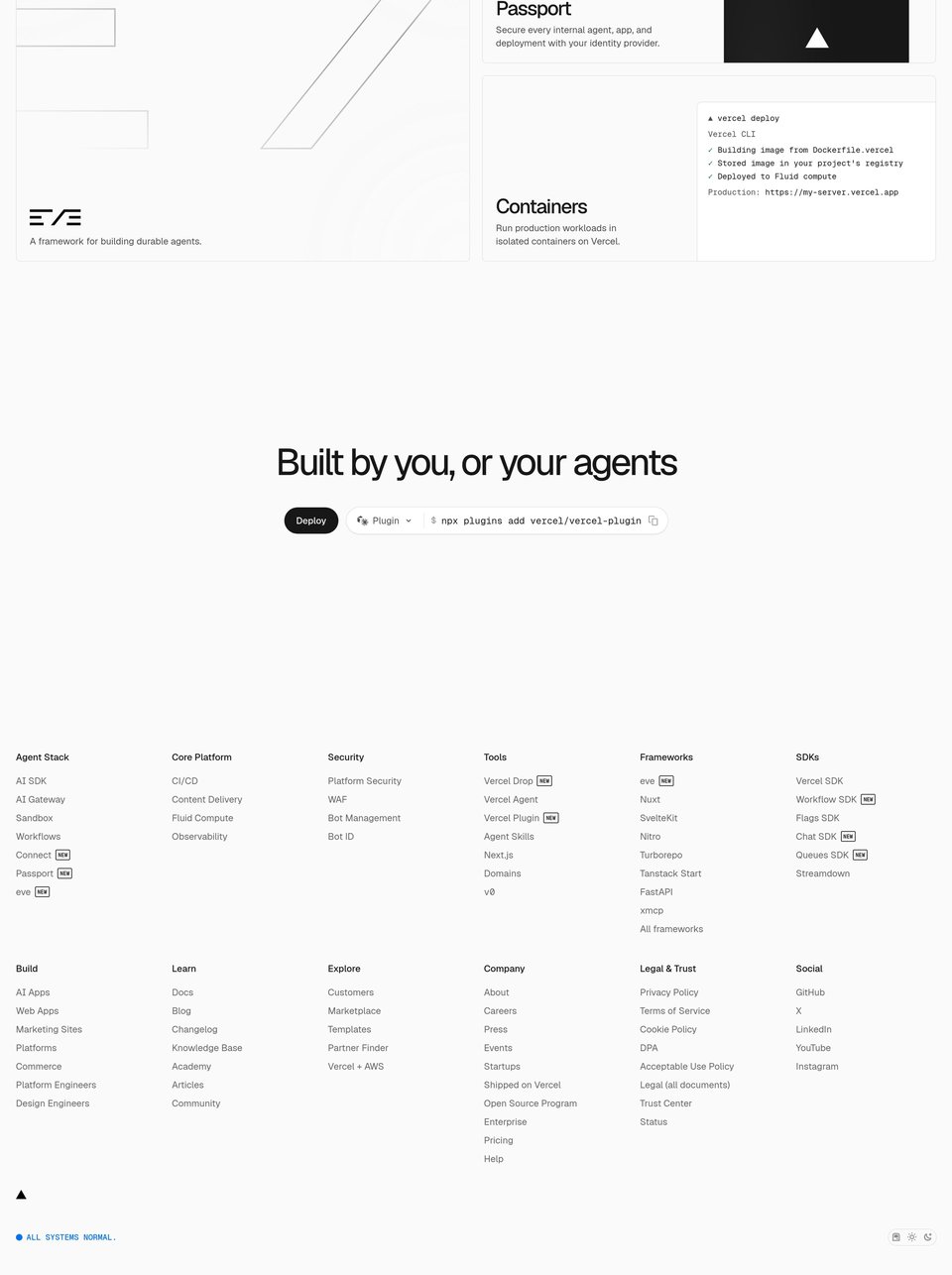
The full-page capture this DESIGN.md was measured from. Values in the file are computed from a real session, not estimated.
vercel.com
A design reference from vercel.com, a public website: patterns, never its code or assets. Own this site? Request removal.